
Newsletter
Newsletter
We highlight some of the best mobile and app innovation from Paris 2024 Olympics coverage. Who deserves the gold?
2nd August 2024
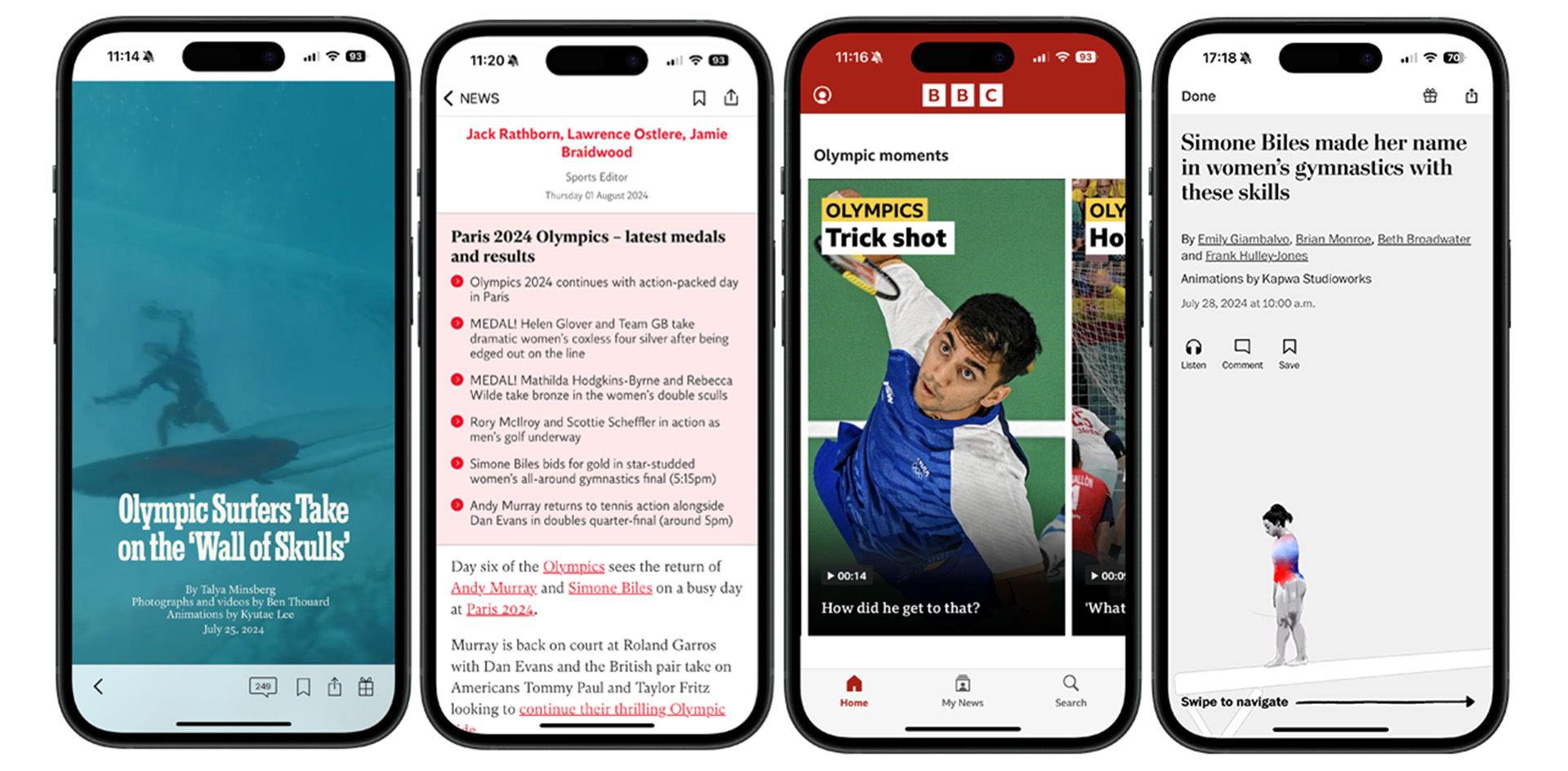
Big set-piece events like elections or the Olympics provide publishers with an opportunity to experiment with formats they might want to roll out more widely, and the Paris Olympics highlights not only the world’s best athletes but also some of the most innovative mobile storytelling.
Digital storytelling has developed its own style, including animations, data visualisations, and scrolly telling, which was made famous by the New York Times’ Snow Fall. Scrolly telling is a digital storytelling experience which reveals images, video and text to the viewer as they scroll through a webpage or a mobile story.
We want to inspire you with some examples from the Olympics, but we also are realistic. Snow Fall was created by an 11-person team at the New York Times and was work intensive at the time. However, within a week after it was published, 3.5m people had viewed it. The lesson that the New York Times took away from Snow Fall was that their journalism needed to be more visual, and that lesson is even more important now, as audiences shift to mobile video.
James and I looked at 13 English-language publishers across North America, Europe and Asia to arrive at our shortlist of excellent mobile Olympics features. They cover data visualisations, live blogs, off-platform content and interactive features.
Medal counts are a standard element of Olympics coverage, and most publishers tick the box of having a table of countries. This presentation looks fine on mobile, but both the Washington Post and the New York Times took things one step further by providing stripped-down highly visual presentations that communicate a lot of information in mobile-friendly formats.
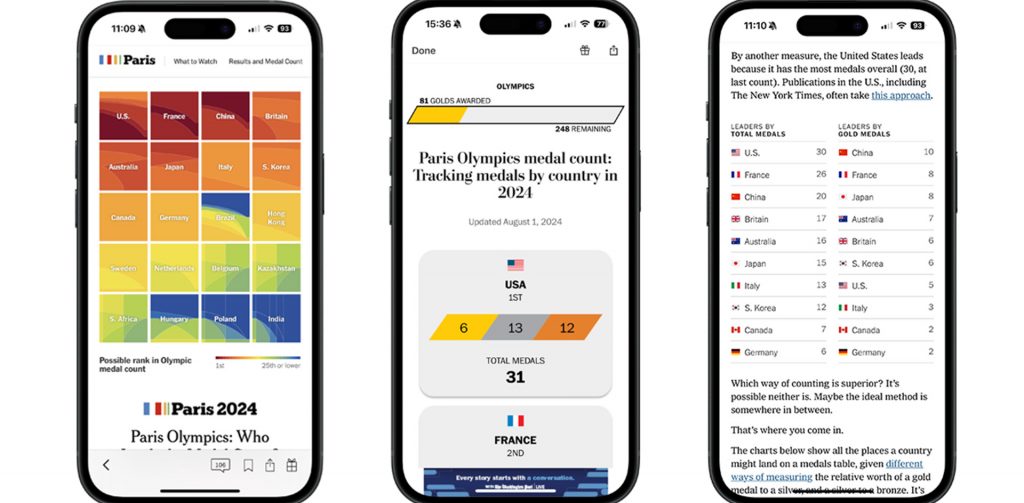
The Washington Post’s medal count starts with a visual about how many gold medals had been awarded and how many remained. Below that, it lists the US and other leading countries, with squares sized according to the count of each medal. This visual presentation is echoed in their overall table. The intensity of gold, silver and bronze sweeping parallelograms for each country is based on its relative number of medals. There is a toggle for sorting the table by the total number of medals or the total number of gold medals.
The Post then superserves stats-obsessed sports fans by showing which countries are performing better or worse than the last Olympics in terms of gold medals. France is doing much better than Tokyo 2021, while Japan is faring worse (but still doing well). Do host countries usually have an advantage? Users can also search results for all the events and see countries that are winning their first gold medals or their first medals ever. Large buttons and helpful search fields allow mobile users to quickly and easily get the information they want.
The New York Times has traditional results but also another presentation, “Which Country is Doing Best?”, that goes in a more abstract direction. James likes to prod me (an American) about how the US is the only country that measures Olympic success by the number of overall medals rather than the number of gold medals. Well, yes, and the US is the only country in the world that celebrates International Standards Day on a different day than the rest of the world. We’ve got form.
What is the best way to measure Olympic success? The New York Times decides to be resolutely non-partisan on the issue and give you multiple visual representations of success. Each country’s results are visually mapped to a square with deeper shades of red representing more Olympic success. If you only care about total medals count (all medals are equal), that is in the lower-left-hand corner, and only caring about gold medals is in the upper right-hand corner. The rest of the square represents different ways of weighting for the medals. Abstract? Absolutely. Interesting? I’ll let you be the judge.
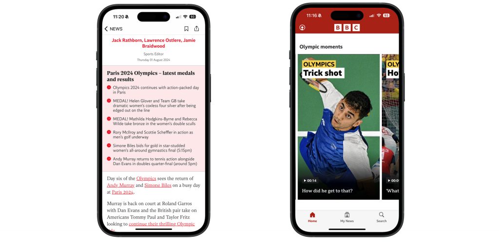

The Olympics are the ultimate live event, and live blogs are tailor-made for the rapid-fire pace across multiple events. Digital media has allowed publishers to bring together text, audio and video, and apps add the value of push notifications and live updates on the lock screen. The Independent app leverages all the multimedia elements in its Olympics coverage with video, audio and text updates in its live blog. It has a tight bulleted summary at the top of the live blog summarising the latest medals and results.
The New York Times shows the value of leveraging content on its site and off-platform as well. In past Olympics, they have created clever animations to show the results of key events, and they used that format again for Paris 2024 to highlight how dominant American swimmer Katie Ledecky was in her signature event, the 1500m freestyle. They used the animation on their site and also posted it on their Instagram account.
Similarly, the BBC used its Olympics Moments vertical video across desktop and their apps. The vertical video format is ideal for mobile, and for several years, the BBC has been using social media video formats and techniques across its platforms, even on broadcast.
Major broadcasters and publishers plan out their coverage of events like the Olympics long in advance, and they experiment with storytelling formats that aren’t possible on daily deadlines. With all the attention paid to the Olympics, media outlets compete with cutting-edge digital storytelling. The Paris Olympics coverage shows how far the state of the art for app storytelling has come.
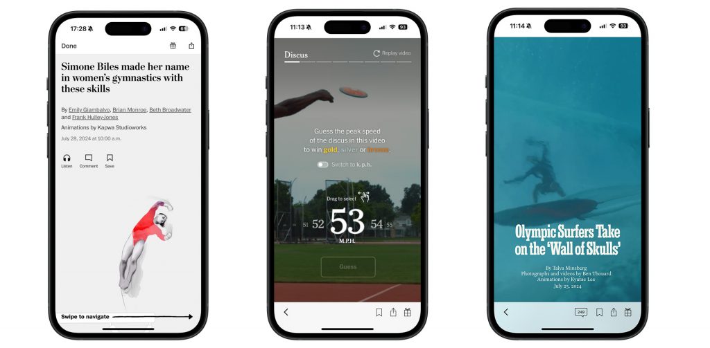
The Washington Post created a feature showing signature moves that have allowed Simone Biles to return to the top of the podium both with the US women’s gymnastics team and the women’s all-around competition. The web presentation features artistic animations which communicate her power, speed and grace. Under each animation, a button allows audiences to see each move broken down. The app presentation has helpful visual cues for a seamless swipeable experience.
Returning to Snow Fall for a minute, the New York Times learned the value of visual journalism, on desktop and mobile. Layered video, images and animations are revealed as you scroll through the story. In this case, it is about Olympic Surfers Tak(ing) on the ‘Wall of Skulls’ off of Tahiti in French Polynesia. The animations show the dangers of waves up to 50 feet high, breaking over sharp coral reefs with less than a meter (3 feet) of water clearance. The videos of the waves rolling over the reef provide a perspective few will experience. It shows how towering waves are formed when “deep, open ocean abruptly meets the shallow reef below”. The presentation is as effective in the New York Times’ app as it is on desktop, a different but equally powerful vertical video presentation full of a range of visuals including maps, surf tables and infographics.
If you want a fun, interactive challenge, check out the NY Times’ How Fast is That Going? It’s a quiz. It’s vertical video. You win gold if your guess is within a few miles or kilometres per hour of how quickly a discus, an archer’s arrow or a badminton shuttlecock travels. In the background, a full-screen video of elite athletes plays, and the slider for registering your guess (educated or not) works as well in the app as on the web.
A few takeaways from these presentations:
If you have ever wanted to be an Olympic judge, here is your chance. After looking at our shortlist, score them on a scale of 10, and also, feel free to nominate other Olympic mobile projects (including your own).
Here are some of the most important headlines about the business of news and publishing as well as strategies and tactics in product management, analytics and audience engagement.

Newsletter

Newsletter

Newsletter

Newsletter
Newsletter