Newsletter
Newsletter
We highlight three lessons publishers can take from the New York Times app re-design to drive their editorial and commercial success.
4th October 2024
Our recently launched Mobile Matters community is growing, and if you are interested in or work in mobile publishing, you can join by filling out this short form. This week, we’ve talked about the tactics publishers in the community have used to drive downloads. Competitions got a good mention. I won’t say much more because we’ll cover that in a future Media Bulletin.
We have also added links to Media Bulletin editions covering topics related to channels on analytics, audio, community and revenue.
If you’re a publisher and want to join the beta group, please complete this short form, and you can also check out the Mobile Matters hub on our website where we’ll be building a library of case studies and strategies guides on mobile publishing best practices. Now, on to this week’s Media Bulletin and what publishers can learn from the New York Times major app overhaul.
The New York Times released a major app update this week. While few publishers can afford the engineering resources it can, the redesign holds several lessons about the future of apps and also how design choices can support great user experience and your business model.
The Times is investing in its app because, as with most publishers, it serves their most engaged subscribers. “Ninety per cent of subscribers return to the app the week after using it, and they tend to spend twice as much time reading in the app as they do on the web,” said Mark Wilson, the Global Design Editor at Fast Company, in his review of the redesign.
As the Times has become one of the most successful English language publishers in the world, it has expanded the content it provides as well as its product mix, adding several standalone content products – Puzzles, Cooking, Wirecutter (reviews) and the Athletic (sports) – each with its own app.
Its redesigned app shows how publishers can:
In announcing the app redesign, the Times’ said, “we publish an astonishing bounty of great journalism”. However, simply generating a lot of high-quality content isn’t sufficient for success. Users need to be able to find the things they are interested in in order to feel they are getting the full value from the app.
Apart from inflationary pressures, one of the most common reasons users cancelled their subscriptions was that the cost wasn’t justified by the perceived value, according to research from the Reuters Institute. Publishers have worked to improve their onboarding processes, including in-app welcome screens, to help customers get the most out of their subscription.
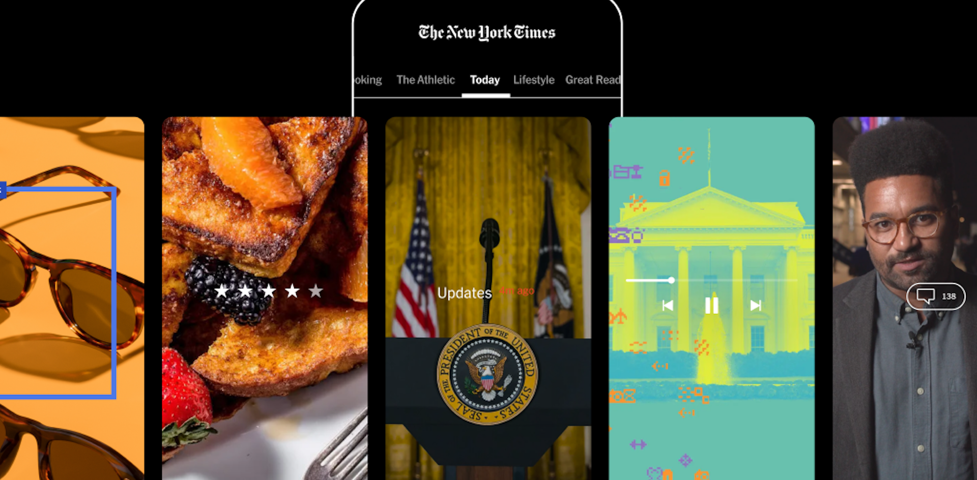
The Times’ is using the design of their new app to achieve the same goal. While a lot is familiar about the app, such as the centrality of the Today section, “the Times has ostensibly gone from presenting one feed to 10,” Mark Wilson said.
The Times has always allowed users to navigate through sections, but these new feeds aren’t necessarily sections in the traditional topical sense. The familiar Today feed of important and breaking news is in the centre of a new top “ribbon”. When a user swipes the ribbon the right, they see both major news topics – currently the 2024 US election – as well as major newspaper sections including a visual Lifestyle section, Opinion and “Great Reads”, to highlight “some of our most exceptional storytelling”. Swiping left on the ribbon allows users to sampe content from its products, Cooking, Wirecutter, Puzzles and The Athletic. such as Cooking, Wirecutter’s reviews or the Athletics sports coverage if the user swipes right.
“By helping people more easily discover, read, watch and listen to Times journalism, the new Times app is a powerful resource for them to understand the now and make the most of every day,” Alex Hardiman, Chief Product Officer of the Times, said.
The redesigned app retains the personalised You tab at the bottom, highlighting stories based on user interests.
What is striking is that the New York Times is rethinking how it presents content breaking from a print-centric view to a product and audience-centric approach.
The new app design not only helps the audience to discover relevant content, it also supports the Times’ effort to upsell users to their ‘super bundle’. This is part of The Times’ bundling strategy which aims to increase the average revenue per user, a KPI it highlights during its quarterly reports.
Several Times product and design leaders said it isn’t trying to create a super app for its super bundle, but it does use it to tease users into its non-news products. “We’re kind of giving you a preview of everything, so that you can discover them within the news app as part of the New York Times universe,” Kristen Dudish, VP of product design at the Times, told Nieman Lab.
Of course, as we have highlighted before, the super bundle isn’t just a tool for the Times to increase its revenue but also to increase retention. Multi-product users are 40% less likely to churn, Alex Hardiman told Axios. And now “more than half the Times’ 10.2 million digital-only subscribers were paying for more than one Times product,” according to Nieman Lab.
This is logical: The more subscribers use the full range of your products, the more value they get. This new app clearly communicates that value so that a subscriber is more likely to upgrade their subscription and develop habits with a wider range of the Times’ products.
Reviews of the new app also spoke about how it borrowed from the design language of other apps, especially social media ones. “(I)t also reminded me of switching between feeds on Bluesky or X,” Neel Dhanesha, wrote in Nieman Lab’s review of the app. Kristen Dudish, VP of product design at the Times, and Emily Withrow, SVP of product at the Times, also referred to the new top sections as “feeds”.
The lifestyle section breaks the typical news app convention of a stream of headlines, instead showing a grid of images with headlines overlaid on them, which feels almost like Flipboard.
The New York Times isn’t alone in taking inspiration from social media for its app. The BBC first embraced vertical video in its app in 2017, which increased the number of video users in the app by 30 percent and videos per user by 20 percent. By embracing social video formats, they have also been successful on TikTok, amassing 3.2m followers on the platform. But as with many publishers and broadcasters, they prefer to have a direct relationship with their audience rather than relying on platforms, and they are now launching their own short-form video app.
One lesson from the Times’ new app is how content, product and design strategy and teams work together to balance editorial and commercial goals of the organisation with user needs. “The user experience is built on a strong foundation of our core design principles, and this effort reflects design, product and newsroom colleagues working together really successfully,” said Steve Duenes, deputy managing editor overseeing visuals.
As other publishers think about the future of their apps, the New York Times highlights things to consider:
If you want to continue the conversation about using apps as an acquisition tool, please, join the Mobile Matters community, and let’s discuss your ideas about the future of your apps.
Here are some of the most important headlines about the business of news and publishing as well as strategies and tactics in product management, analytics and audience engagement.
Newsletter

Newsletter

Newsletter

Newsletter
Newsletter